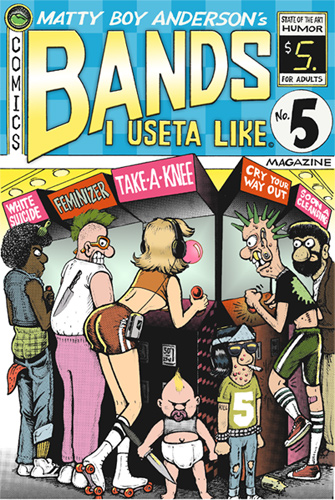
Why do bad covers happen to good albums? Is there some sort of unspoken “aesthetic limit” that dictates that a certain quantity of enjoyable music must be balanced with a cover so hideous that joints cannot be rolled upon its surface? Sure, album art itself has more or less gone the way of the dodo in the past ten years, but does that mean that such a tremendous percentage of album covers have to be such a graphic-design abortion?
We’ve all seen one of those “Worst Album Cover” sites at one point or another. I’m not trying to compete with any of that. However, I do intend to share with you the albums that have personally irked my damned fine artistic sensibilities. You’ve probably seen these before, maybe you haven’t, maybe you wish you hadn’t. You won’t have to worry about any Roger Dean covers, because everyone I’ve ever met who was into Roger Dean was a total douchebag, thus I seldom bother to listen to albums with Roger Dean covers.
Anyway, let’s get this over with.
Look, I don’t mean to pick on Zapp. For those of you who don’t know (i.e. whitey), the funk reign of Ohio’s Zapp ended tragically in 1999, when Larry Troutman shot his brother Roger dead, then capped himself moments after. Zapp’s talkbox-flavored grooves were just experiencing a comeback thanks to Dr. Dre and Tupac, and that pretty much fucked it all up. It was a real shame, and to be honest, I try not to remind myself that the music I’m enjoying is, technically, in part the creation of a murderer.
Anyway, above is the front cover of Zapp’s first album. You have to remember that this came out in 1980. On vinyl. So this monstrosity came at you in full color at almost the size of a TV tray. If I’d had this when it came out I would’ve gotten the shit kicked out of me. It seriously looks like it was done in dime-store markers. It’s a suitcase packed for Uglytown. It’s actually a smaller image flanked by scattered little card-like things, which are too small to read on my copy (magnifying just brings out the halftone). There are also two plastic flies for some reason. Why would anyone imply that their album attracts flies? Flies and keys?!? WHY??
Usually when I am listening to this album I turn it over. The back is no prettier.
Holy shit. She-Hulk is squeezing toothpaste on the goddamn thing. I’m serious- you can see the “A”, as in “Aim”, on the tube. My teeth itch looking at it. Well, to be fair, my teeth itch all the time, but still. Egad. Another thing that bugs me (other than MORE plastic flies) is the extra “P” in “Brand New PPlayer”. I have a hunch it’s meant to be consistent with the extra “P” in “Zapp”, but I half-expected the vocals to do some sort of stuttering thing (they do not). That particular song is not so hot anyway.
Next up is a classic.

Here we have another debut platter, this time from Steely Dan. I know Becker and Fagen have remarked on the homeliness of the Dan’s visual side in the past (I’m talking about their album covers, not them), but their first offering from 1972 really takes the shit cake. It’s stained like it should stink of roast beef residue and unknown bodily effluvia. The naked muscleman, coiled hippie girl and giant feet don’t promise to be any more fragrant. A nameless street is lined with sinister faceless women who stand idle and surely are long dead. Dangling bananas suggest a gaping vagina, as does the uncomfortable close-up of the lips drooling rainbow snot. AY CARUMBA! SAVE ME MEESTER BACK COVER! TAKE ME AWAY!!!!

Wow. Did somebody leave that on the bathroom floor? Because damn. The great thing about album covers like this, is that you don’t have to take care of them. Leave ’em in your car, on the lawn, up a dog’s ass, whatever. They already look like shit.
Okay, one left for this installment:

After this came out in 1999 I pretty much flipped Ministry the bird. I should’ve jumped ship after “Filth Pig”, but what the fuck, I gave ’em another chance. It’s not enough that there’s only one decent song on the thing (at least it’s first). It’s not enough that I paid mall-price for the thing at Best Buy. It’s not enough that the album’s title was the beginning of a horrible trend punning well-known titles (“Dark Side Of The Spoon”). No: the fuckheads in Ministry had to put a human garbage bag naked in a dunce cap on the cover. And even that was not enough. Naked Wal-Mart Shopper appears in lavish pictures on the inner sleeve. I’m not going to bother with scanning the back cover, which is a close-up of the nude blob’s backside, ass-dimpling and elephant thighs in proud relief like a fucking geode. Thanks again Ministry. It’s great to feel even stupider than I already did for buying your album.
That wraps things up for this installment of Ass-tacular Album Art! Next time maybe we’ll get to that George Benson album where it looks like someone wrote his name in jizz.
This article was originally published on Mike the Pod, 5/23/07.


You must be logged in to post a comment.