
Do you still read comic strips? If so, where?
If you read them in a metropolitan newspaper, you are reading syndicated comic strips. This is the traditional method by which comic strips are published. Syndicated cartoonists can make big bucks because they get a fee for every different newspaper they appear in, and then there’s the merchandising. Seventy years ago, it was not uncommon to see syndicated cartoonists living large alongside movie stars. They were feted as a new style of raconteur. At his peak, the artist of Dick Tracy got a shiny new Cadillac, every year. Syndication is the ultimate goal of the working cartoonist.
I myself only came within a hair’s breadth of being syndicated, in the early 90s. I submitted proposals for my Lemmings strip to about 30 syndicates. Each syndicate receives thousands of proposals per year, of which they accept maybe two. I actually received positive feedback from three syndicates, which steeled my resolve like a motherfucker, and made me ten times the cartoonist I had been. That’s how it’s supposed to work. Getting a comic strip syndicated is even harder than getting a movie script greenlighted.
If you’re reading comic strips on the Internet, then you’re seeing the same thing you see here: comic strips that were either scanned or produced on a computer, and uploaded to the web. That’s it. Big difference, yes?
Remember this when you see a newspaper strip that’s a wheezing dinosaur. The forces that shaped it were set into motion long, long ago. Newspaper cartoonists work months ahead of deadline, often half a year, the same as a Simpsons episode. It’s borderline impossible to stay completely current. Meanwhile, you could whip out an image in less than five minutes on a laptop, and if you play your cards right, a million people could see it. An unfair element of competition has been introduced, one that works against the craft itself. For example:
You’re not supposed to hunt down a “comic lettering” font, you’re supposed to get better at lettering.
No popular comic strip is hard to read. For fuck’s sake, it’s meant to be a point of pride for cartoonists. When the paper tells you they have to shrink your strip to save space, you counter by making your composition more economical. You don’t “reduce your text boxes”. If you peruse the Garfield and Bloom County strips from their beginnings, you’ll witness a gradual improvement in lettering. Jim Davis got so good that Garfield could be currently utilizing a font based on his hand, and I’d have no idea.
My career as a cartoonist began when I was published in a college newspaper, which is the best place to pay your dues and workshop material. Syndicates have varying submission guidelines, but all of them want to see at least a week’s worth of strips up front. My college gig was a godsend, which is why I hung onto it for four years after I dropped out (they finally fired me). Think about it:
- Create your own cast of characters and setting. Don’t copy anybody.
- Write a funny strip where these characters interact. Try not to use a shopworn formula for the joke.
- Really, work out a joke formula in three or four panels. Set-up, delivery, punchline. Easy, right?
- Americans read left-to-right, and the average reading time of a comic strip is 20 seconds. You really think that joke works? Look how much exposition you had to use.
- You copied an old Peanuts strip. Start over.
- No no, you copied Doonesbury. Not so easy, is it?
- I guess you could call that finished.
- Do ten more.
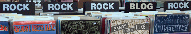
Bands I Useta Like was part of a proposal package I formally submitted to Stomp & Stammer in 2002. Among those who didn’t bite were Maximum Rocknroll and Creative Loafing (who I’d previously worked for in the mid-90s). Currently there are about 110 strips. If I’d had to produce the strip more frequently than monthly, there’s a good chance I’d have burnt out years ago. So the arrangement is an ideal one, and a shitload of people have seen the strip.
I tell you all this so that when I give today’s subject the business, you’ll know whereof I speak.
Pre-Internet, if you wanted to sample cartoons from colleges around the country, you had to visit the comic book store. The better ones had a “small press” section, which is where I’d ask to have my comics placed. While there I would hunt for comics from colleges I had no earthly hope of attending.
So it was I found Thatch.

It’s entirely possible I shook the very foundations of your world with that image. You thought you knew. You so, so don’t.
Teenagers across generations have one thing in common; they all think they were the first to discover something. Now, they get on the Internet and act like no one’s ever raved about “political correctness” before. They see college students being idiots and assume it’s a new trend. And as sure as the sun will set, they think they’re experts on the comic strip medium.
They’re not. They’ve mistaken a very narrow field of photographic memorization for wisdom. They saw some shitty homemade comic strip, surmised correctly that it looked easy, and based their standards on that. Meanwhile, did you read all that shit I started this off with? See the difference?

This book is from 1991.
It’s also not great.
However, it referenced “political correctness” about twenty years before you did. So try to understand that for some artists, it’s been a thorn in the side for a long, long time.

Right off the bat we’ve got problems. “Tripp Biscuit” is like a grown-up buffed-out Michael Binkley from Bloom County, and the art style owes way too much to Breathed. Jeff Shesol’s upgrade is to dot the eyes with O’s, which makes everyone look terror-stricken. He never “settles” into a look; the strip consistently appears to be drawn under hasty protest. But here’s the thing- the writing is very au courant, and Shesol’s lettering was top-notch out of the gate. That’s what keeps the strip from looking tossed-off.
Think about it. The lettering is a secret clue that you’re looking at something more complex that it appears on first glance. New Yorker cartoons are often very primitive, but this is offset by the imprimatur of the italicized captions. See how the juxtaposition works? When you do, you’ll see why lettering comic strips with fonts often looks stale and cheap.

These two are really good. I’ll wager you laughed. The sense of economy is strong, the jokes are well-paced, and Shesol introduced goofy alter-egos of his main characters with great ease, in previous strips. I mean, this didn’t run in 200+ college papers for nothing.

These two are also funny, and I’m betting that for some of you, they hit reeeaaal close to home. The dude with the mood ring is Sumner Phillips III, “prep-schooler-turned-Deadhead. Followed the Grateful Dead last summer. In Daddy’s BMW.”
Shesol’s rendering of hands is not great, but it’s an improvement over Breathed’s, for sure. The mitts of Bloom County residents look like spiny sea urchins. Both Bloom County and Doonesbury utilize the borderless speech balloon, as Shesol does here. To be frank, it was a “mode” of political cartooning that was nearly an obligation for a few years, post-Jules Feiffer. I clearly recall Crumb lampooning it in his old sketchbooks. So I don’t entirely fault Shesol for operating within an established idiom. It just looks “political” to readers somehow.

Much sport is made of fraternity brothers and their bizarre customs. I included these for the hippie who shuffles into the last panel, who I think is the funniest part of the entire book. Look at this poor bastard sidling up to the big tough frat guys, so desperately constipated that he’s dragged himself to a hostile bake sale for relief, where he whimpers “dude– got any bran?”

These two are just funny as shit. In fairness, I’m including the ones that make me laugh out loud, where applicable.
Despite my harsh criticisms, Thatch was a sharp strip overall, allowing for its propensity to dabble in lengthy pop-culture asides. Again, I can’t count that against it, when it’s something a syndicate considers desirable. Whatever its visual shortcomings, Thatch made up for with its surprisingly appealing characters. Even “Sloane Wharton” (I see what you did there), the “heartless, shallow rich bitch” (from the strip’s introduction) becomes slightly less one-dimensional by the end, if not likable.
The strip is at its best ridiculing student lunacy of all stripes. No one, not even the title schlep, comes out on top. These next strips could’ve been written yesterday, except there’s no way the woman would say “you guys” in 2016.

Oppression, hyphenated Americans; it’s all there. Of course, oppression as fodder for laughs goes back to Monty Python and the Holy Grail. Only in recent years has it become a tool of flagrant victimhood.
Thatch was a better strip than I’m making it sound here. If Jeff Shesol is smart, which he clearly is, he’s already bringing Thatch back. As prescient as it was in 1991, there’s much more material nowadays for strips, insane election year notwithstanding. However, once again, there’s a difference between then and now. See if you can spot it in this final strip, featuring Politically Correct Person and the favorite professor at Wayland University, Eric “Woodie” Woodman.


You must be logged in to post a comment.