When you’re polishing the brass railings of the HMS Titanic, it’s important to remember one thing; do it with style. Otherwise, why bother? The more you polish, the better you get. So what if the ship hits the iceberg and sinks?
Since 1998, largely to keep myself out of a rut, I’ve changed the heading of the Bands I Useta Like strip every few years. In the very beginning (when it was self-published), it looked like this:

The title is an antique typeface that I photocopied out of a book, cut, and pasted. (I didn’t have a computer until 1999.) In late 2002, when I got the gig at Stomp & Stammer, I re-did the layout of the strips I’d already drawn, so they’d fit properly on the printed page. I was an insane obsessive with fonts; I downloaded any TrueTypes that I could for free. Soon I had so many that my computer would lock up while accessing them. I was Little Lord Font-leroy. It was pathetic, but useful. I still have most of the damn things on my current rig; something like 700.
2003- “THE DYMO”
For the first five years of the strip, I used a font for the heading that simulated those old “Dymo” label-makers that go clickety-click. I meant it to look like a DIY all-ages punk show flier. In the style of my previous rag The Last Laugh, I doodled a simplified tableau to go behind the words. I know this is boring. Who gives a shit.

From an old desktop wallpaper I produced, so you can see the doodled people and objects clearly.
I think you can still buy Dymo label-makers at the stationery store. Wait- the stationery stores are all gone? Where do you buy resume paper and scratch-and-sniff stickers, then? Oh; at Target? Carry on, ruiner.
This is what a Dymo label-maker looked like. They were awesome, even if the labels curled up and popped off the cassette case spine to which you carefully affixed them. The tape came in red, black, and green.

CLICK-CLICK tic-tic-tic-tic CLICK-CLICK tic-tic-tic-tic-tic CLICK-CLICK
In a few years I got pretty tired of looking at it. I had no earthly idea the strip would live past the initial handful. The time had come to pretty up the joint.
2008- “THE TATTOO”
Yes, this is intended to look like a tattoo. Originally, I planned to Photoshop it onto a picture of skin, to make it look real. Instead it just looked like shit, so I inverted it to make it consistent with the previous “Dymo” heading. Note the oh-so-clever “Born 1998” inscription on the tombstone. Since some of you were also born in that year, I have to point out that I wasn’t. I am over twice as old as you.

The syringe, razor blade, trash can and cassette are all repeated motifs. I studied real tattoos to get the lettering and the border details right. This might be my favorite. I dunno. I know I like it better than the next one.
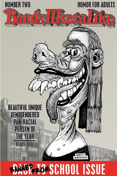
2013- “GRAFFITI”
I love graffiti. Atlanta is teeming with it. It’s often the only art any of us get to see on a daily basis. Before you get your dander up, let’s be sure you understand the rule.
Gang markings spray-painted on public spaces are not graffiti. They are BLIGHT, which is VANDALISM. Graffiti is ART. Not vandalism.
A simple test: if it’s beautiful to look at and impresses you, it’s GRAFFITI. Real graffiti taggers are conscientious about where and when they tag. They don’t just mark up the sides of buildings and bridges with shitty squiggles. Creating blight will get you brutally beaten by graffiti taggers. If you stain a beautiful piece with blight, and a graff crew catches you doing it, you will be lucky to escape with your life. Ignorance of this rule will not help you.
It’s fine if you dislike graffiti, but don’t ever call it vandalism. It’s art. Period. It wouldn’t mean as much to its creators if it wasn’t.
Anyway, let me hop off the soapbox here. As with “The Tattoo”, I studied heavily to get the piece as accurate as I could. Like I said, Atlanta offers plenty of graffiti art to observe for inspiration.
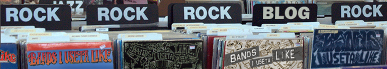
The result is my least favorite. It really needed to be in color to be effective, which isn’t an option. It looks kinda cool in the “record rack” blog heading, however.

I’m really pleased with the stippled city skyline in “BANDS”, now that I look at it again. That’s stippling, by the by, not “pointillism”. I once had a heated argument with a dumb fat bald asshole about this. “Pointillism” is color, like Seurat. Stippling is black ink on white paper. I only went to art school, and have been drawing comics professionally for almost 30 years. What the fuck would I know.
There’s the razor again.
2016- “THE ROLLING STONE”
Let me tell you of one of the highest compliments I have ever received, in contrast to that little vitriolic aside.
I have a custom Bands I Useta Like shirt that I had made at Bang-On, in Little 5 Points. That’s a shop that will print just about anything onto a t-shirt, which lasts for years and years. It’s a bit pricey, but it’s absolutely worth it.

Anyway, I was wearing this shirt a couple years ago, and my friend asked me where I found the font for the original Rolling Stone logo. I replied proudly that I’d drawn it by hand, in the style of the late great Rick Griffin. There is no font.

I used this for the first issue of Bands I Useta Like; the second features a version of Rick Griffin’s logo that Rolling Stone uses to the present day. The only way to do these is by hand. It takes days. You can’t fake it. That’s why I use this logo so much. I worked my ass to the bone on it. The words “Rolling Stone” do not contain the letters B, A, D, U, or K. I had to approximate those.
This began a personal quest to simulate the work of Rick Griffin as closely as humanly possible, respectfully. It became a meditation in practice. The goal is to look at something I’ve drawn and for a few brief seconds, forget I was the one who drew it. It’s a healthier use of my “forger’s instinct”, which nearly saw me expelled from college. There is no way I can describe the rush to you. It’s godlike.

The double-whammy: a forgery of Griffin’s second Rolling Stone logo, combined with a totally hand-drawn forgery of Basil Wolverton’s “Beautiful Girl”, from the cover of MAD #11.
The thing is, when you do this, you have to continue to top yourself, or you feel like you’re treading water. I already took a shot at Rick’s legendary Rock Art piece (see site margins and intro page), so I had to go for one of the bigger Griffin enchiladas to get my fix.
2018- “HAOXOMOXOAH”
This took three 10-hour days to complete. I had to limit how long I worked on it per day because my hand started cramping up, causing mistakes. There was definitely a point, about a third of the way through, where I thought I was in way over my head and couldn’t do it. Rick Griffin was fucking hardcore.

Before you ask, hell yes I’m gonna put it on a shirt, but I get to wear it. This logo is a tribute to Rick’s cover for this album I have not heard:

I wanted to do the other parts around the band’s logo, but time ran out. This stuff came straight out of Rick Griffin’s mind. I am just impersonating. I mean, holy crow, imagine having the ability to just create that image out of nothing. No wonder people love to gaze at it while on drugs.
What more could any artist ask for?


You must be logged in to post a comment.